5 Excellent Design Tips to Improve Website User Experience

Having a website is more important than ever in today’s marketing world.\It is the backbone of your brand’s marketing strategy and can bean essential tool and core anchor of your business.
That said, constantly emerging trends can make your website seem outdated. Though a redesign may often be desirable, you may not have the resources or time to spend on such a massive project. We’ve put together 5 excellent design tips to help improve user experience.
Explore White (Negative) Space
White space, also known as negative space, is a term in visual arts for surrounding parts of an image that do not draw attention. Usually, they are empty or unused, like a cloudless sky or a black and white wall. Though dull on its own, when used artistically, the white space can enhance and complement the central image, improve readability and make the picture easier to see.
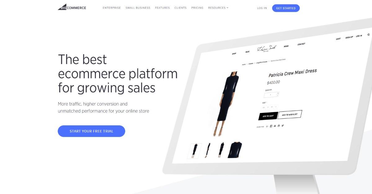
White space embraces a minimalist style that ups user focus by 20%, and makes your website look new and trendy. The trick is to fill key elements with white space. The bigger the white space, the more it draws the user’s attention.
Avoid dull templates with secondary graphics. Aesthetic elements like colour and typography will visually make up the difference when there is a lot of negative space. The trick is to find an equilibrium between what’s necessary above and envelop it with some white space to bring out the picture or text.
A drawback to the use of white space, however, is it simply takes up space.
Optimize Your Page Speed
Most people on the internet have a short attention span. They find it frustrating to wait an extra second for a page load-time. The emergence of mobile apps does not make it any better – people now consume content on the go; expecting fast results for content they search. They usually bounce when they don’t get it.
You can improve your page speed by compressing all your images with compressor.io before loading them onto your website. An Image file size is often the reason for a lagging page.
According to Discount Domains, an extra 3 seconds of page load-time would increase your bounce rate by 53%.
Use an Attractive Title and Call to Action
People are used to visual cues like colour and words to assess information that is important to them. Also, search engines look for good content through their headings and titles. So, using a title that converts stands you out from the crowd, and boosts your searchability. The use of colour psychology and power words in your title and Call to Actions (CTAs) allow your visitors access your site quickly, creating a good user experience.
Other things to consider are the actual words you use and placement for your buttons. Your CTAs and Headings should include a verb or word that encourages the user to take action. Placing them in an aesthetically visible place on the screen would ensure they don’t slip past it. The right words are psychological triggers that are greatly influenced by your customer’s level of emotional identification to the word. If there are none, then there’d be no action at all. So, focus on making your words timely, bold and speak for themselves.
Avoid Stock Photos
Not only do they look spammy and give off the wrong impressions, but they can affect your SEO.
People are smart and fast at judging a company’s website by their homepage alone. After all, first impression matters. When they visit your site, especially for the first time, they can easily spot a generic stock photo they’ve seen someplace else, a mile away. Stock photography can hurt your brand credibility by standing out as generic and non-unique. Needless to say, these can have a ripple effect on your business as well.
While they may be of high quality, stock photography may not create a connection between the user and the brand. Rather, investing in original photography of your goods and services can do a great job of converting a potential customer.
Streamline Navigation
Navigation is crucial when designing your website – always build it around real user data. Navigation is undoubtedly a map that leads to important places users want to find. It’s devastating to have a disorganized, aesthetically-off navigation interface. When designing or improving your website, you must ensure that all pages can be found, seamlessly.
If visitors can’t find what they’re searching for, then they have zero incentive to remain on your website. They’ll bounce instead, and go in search of a competitor with superior user experience.
Some features of a lean navigation bar include navigation hierarchy, a structured content, and responsive user interface. Check the mobile version of your site while posing as a user, and go over every action; posts and click, so the mobile experience doesn’t change drastically.
One more tip before you go: The simplest sites are often the best. Read up on the latest design trends, and check around the web for inspiration to boost your creativity.