2021 Go-To Guide For Responsive Email Templates Design
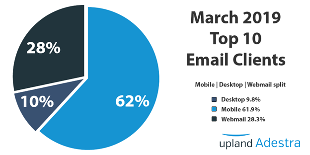
As smartphones continue to become the biggest device segment used globally, mobile-optimized emails have become a necessity. No matter B2B or B2C, every brand is going gaga over the responsive HTML email templates as they provide seamless renderability across all device types without making you stick with single-column designs. Their need is reflected by the fact that almost half (49%)of the US’s traffic came from mobile phones while they accounted for more than 60% of the email opens.

Today, I am going to share the why, how, and tips to designing flawless responsive email marketing templates. Let’s get started:
Why You Should Shift To 100% Mobile Responsive Email Designs
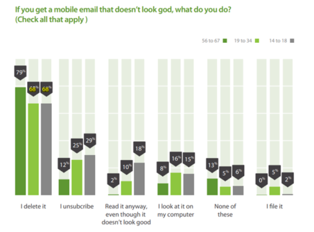
As we said earlier, your subscribers are consuming most of the information on their smartphones and when they receive a message not optimized for mobile phones, they might delete it. Statistically, 68 to 79% of people delete non-optimized messages, thus it can rip apart all the hard work and investment you made in list building and subsequent email marketing efforts:

This can be a big turn down since emails bring a skyrocketing ROI of 4400%. But, here’s the good news: If you aren’t already using responsive design, getting started with it can improve your mobile clicks by a handsome 15%.

I guess that’s enough reason to get started with responsive email designs. Let us have a look at the changes that you need to make in your designing process:
How To Design Responsive Email Templates + Tips
The first step towards designing responsive emails is sticking with a width of 600 px. The mobile screens render this design width with ease and bigger devices will display it in the fixed 600 px width format which is equally pleasant to the eyes. Also, you should avoid keeping percentages as the basis of design since it will sabotage your renderability to a great extent. Choose pixels instead, for better rendering.
You will have to use the responsive table attribute to ensure that your message fits the screen size. If you aren’t using single-column email templates which is advisable, you should define which elements need not be displayed for smaller screen sizes. You can do it easily using “mobilehide{ display: none !important;}”
Keep the font size slightly larger than non-mobile optimized templates which are ideally around 13 to 14 pt. Anything smaller will turn into a pinching exercise for your readers.
You should also keep the CTA buttons slightly bigger than normal as we literally press them with our thumbs instead of clicking them with a cursor. Most of the email developers recommend the size of 44*44 pt since our thumbs find it convenient to push the links/buttons of this size.
Generally, it is advised to use a minimum number of hyperlinks in emails but when designing responsive emails, take extra precautions. Use them scarcely and keep them distant from each other. Stacking them in close proximity can end up making it tough for the user to click on the desired one.
Also, you should avoid keeping your CTAs at inaccessible positions. I strongly suggest keeping them in the above fold of your message to improve the chances of getting clicks. Here’s an example:

On the flip side, you might want to use smaller images as compared to the standard ones. The image should contain lesser details since it becomes hard for mobile users to see too many objects inside the frame. In most cases, they aren’t likely to zoom in on your images, and thus, you shouldn’t depend too much on graphics to convey your message. I also find adding alt text essential for enhancing accessibility. Don’t forget to add a responsive class to your images. Mobile phones with retina displays will require double the size so make the necessary arrangements.
Also, you need to use smaller, compelling email copies for responsive email designs as the reader won’t be interested in an endless scrolling exercise. (Remember, you are going to keep your email fonts above 13 pt!) This applies equally to your preheader text as you will get around 40 characters to support your subject lines. This calls for the overall optimization of your email copy as well.
It is necessary that you test your emails to check if they render properly on test devices or tools like Email On Acid/Litmus.
Before we end, responsive email design needs special attention since it doesn’t exactly fall into Gmail’s good book. It doesn’t support styles in the head of a message, thus leaving you vulnerable to rendering disasters. Outlook is also equally challenging since many of its versions scale the message to 120 Dots Per Inch (DPI.) This skews the message and will require you to enable VML in the head of your HTML code. Thus, you need to handle the design process with care. One of the best solutions to all of these problems is hybrid/spongy coding.
Summing Up
No doubts, designing responsive email templates can be challenging at times but given the user base of mobile phones, it is simply not possible to ignore mobile optimization. Using these best practices will help you design responsive emails but I would again stress testing. I hope this article adds value to your email design process and future email marketing campaigns.
Author Bio: Kevin George is Head of Marketing at Email Uplers, one of the fastest growing custom email design and coding companies, and specializes in crafting professional email templates, PSD to HTML email conversion and free HTML email templates. He loves gadgets, bikes, jazz and eats and breathes email marketing. He enjoys sharing his insights and thoughts on email marketing best pra