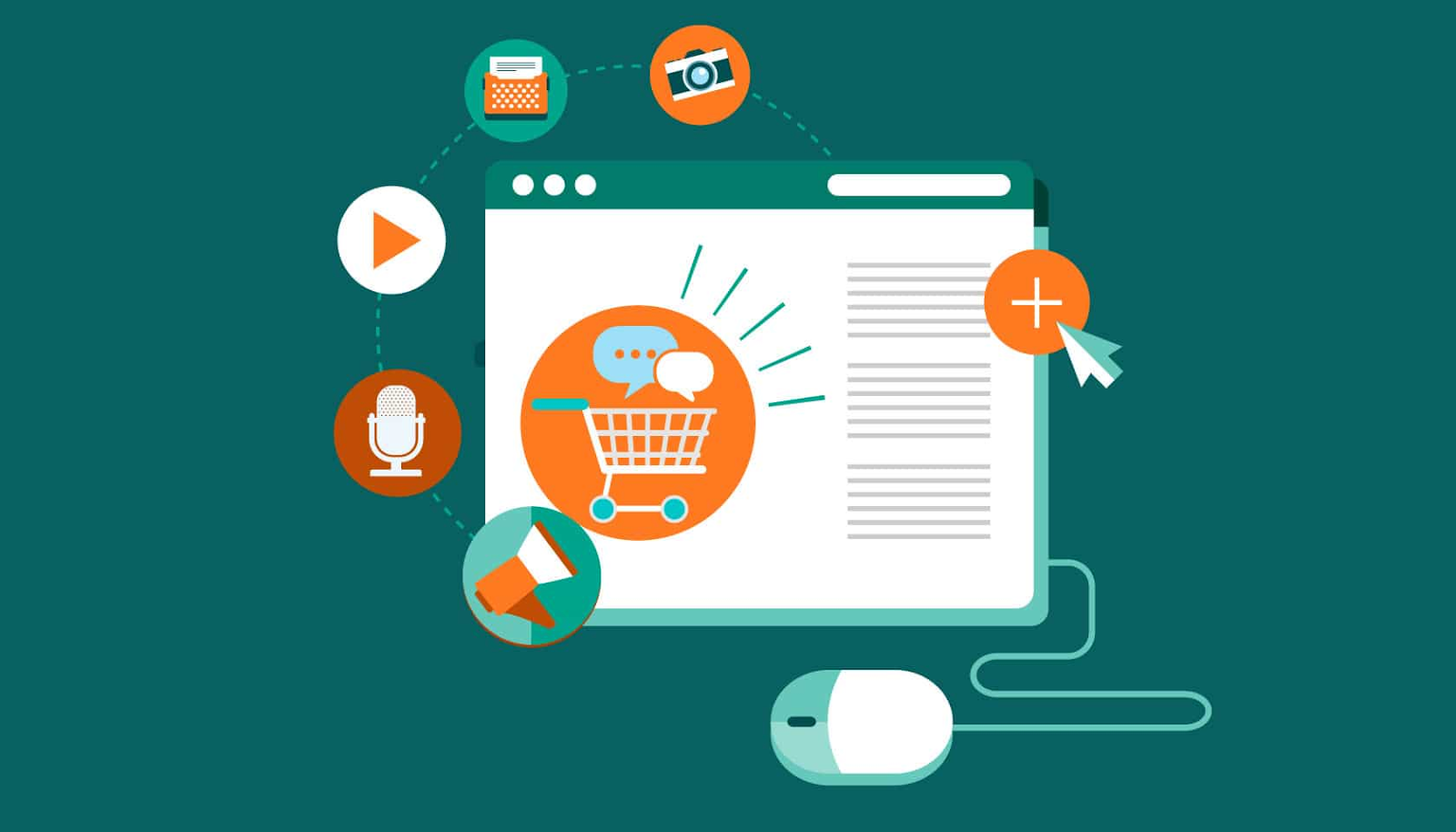
How to Build the Perfect Ecommerce Home Page
Does the perfect eCommerce homepage exist? There are certainly some good examples that set a precedent for quality and UX, but even the best pages have their weak points.
To build the perfect homepage for your eCommerce operation, it takes a mix of creativity, technical know-how, and plenty of real-time trial and error. Don’t expect to get it right the first time, because nobody does!
Still, we want to help save you time, money, and frustration by outlining the must-have features of an eCommerce home page – even if you have no clue where to start.
We spoke with leaders in the industry to hear their best insights and discoveries for homepage perfection, so let’s jump right in.
Instantly Appealing Design
First impressions make a big difference for your eCommerce homepage, and it starts with a design that looks inviting and inspired.
“Think about your favorite eCommerce site and it surely has a visually impressive homepage,” said Rachel Jones, Head of PR at Hope Health. “Your brand template, colors, and typesets should all be on full display, along with super-sharp imagery of your products with a professional touch. Visitors should be able to latch onto something visually and be compelled to explore beyond the homepage.”
Just consider the alarming bounce rate for most eCommerce experiences, and see why it’s so important to make design a key priority.
“Imagine the following scenario: You go into a store at your local mall and are met by a scowling sales assistant,” said Emil Kristensen, CMO at Sleeknote. “The atmosphere is somber, and the rails are overcrowded and disorganized. What do you do? You leave, of course. Similarly, if customers form a bad first impression of your online store they will bounce. The average eCommerce bounce rate is 45.68%. You want to encourage conversions from the get-go; you don’t want users to bounce. Recognize that your homepage is your storefront. It needs to be well-designed, easy-to-navigate and it should clearly display what the customer is looking for.”
Clutter is definitely an enemy of an eCommerce homepage, but conversely, a stark or overly-minimal design can be equally off-putting for first-time visitors.
“You’ve seen those websites that just try to accomplish way too much on the homepage, and it immediately makes you rethink shopping there,” said Jason Wong, CEO of Building Blocks. “When there’s so much stuff happening on screen, it has the opposite of the intended effect, and visitors are less likely to explore. On the flip side, a page with just a single link and no guidance looks try-hard and doesn’t inspire confidence. You want to find a functional middle ground.”
Seamless UX and Navigation
What good is a beautiful eCommerce homepage if it’s hard to navigate to your top products, services, and support features? UX is arguably just as important as looks, if not more.
“There should be no questions about navigating your eCommerce site, even for folks who aren’t fine-tuned in their browsing skills,” said Ely Khakshouri, CEO of Retrospec. “You are not impressing anyone with a convoluted menu or secret tricks to navigate your page. Keep it accessible and simple for the masses to dive in and start shopping. You’ll never regret getting rid of clutter and streamlining the experience.”
Much debate in the eCommerce space is on the subject of home page product access. Some stores find it helpful to display products on page one, while others find it to be overbearing.
“We love to have our products available upfront and center when you access the home page, because we get straight to the point and minimize the need for extra clicks,” said Mehdi Marrakchi, CEO of Mob Hookah. “A huge portion of our customers just browse our offerings right on the homepage and don’t waste time navigating menus. This speeds up the whole process and ultimately leads to more sales.”
For companies offering high-ticket services instead of individual physical products, the homepage UX should be focused on conveying information and answering questions.
“Our goal is to educate visitors about our service in the shortest time possible, using clear images and bold text to get the key ideas across,” said Miles Beckett, CEO, and Co-Founder of Flossy. “The more information we can share in a clear way, the quicker our visitors will dive into the service and sign up. From there, we have the option to create an account, search for services, and get right to the point. Navigation is a breeze and there’s nothing to distract or confuse the user.”
Loaded with Extra Features
On top of product spotlights and essential info, what other features are necessary for an eCommerce homepage?
As customers expect more from their shopping experience, brands must step up to meet the demand.
“We like to show off the benefits of our products as soon as visitors arrive at the homepage, giving them a reason to stick around and browse,” said Jake Langley, CEO of Luma Nutrition. “Our FAQ has all the key questions answered, and there’s a blog available to dive deeper into the ingredients we use. Just having a bare-bones homepage is no longer enough. You need these additional features to earn trust and build authority in your industry.”
Don’t forget to build a homepage that makes sense from the perspective of the business owner, either. This means having options to update and customize the page quickly without disruption.
“Many websites’ success is determined by the products offered and how well the website is marketed, the features the website provides, and both the customer and the website owner,” said Justin Smith, Founder and CEO of OuterBox Design. “As a business owner, it is essential to have the tools to manage your website and that the administrative features fit with your business processes. For example, if you offer payment terms to your customer, you’ll need to be sure the platform you’re using gives you the ability to set a customer’s credit limit. Before diving into an eCommerce project, think carefully about the eCommerce features needed, or you’ll be regretting it later!”
Another powerful eCommerce homepage feature is the option for visitors to sort inventory by product types and needs. This gives the feeling of being in-store with a helpful sales rep who cares about your shopping experience.
“This feature is a game-changer for sites like ours that feature thousands of products in dozens of unique categories,” said Trisha Bantigue, CEO of Queenly. “It allows customers to jump directly to the products they want and similar items that might be of interest. Sorting by color, size, material, and other variables is essential for any clothing retailer. It requires a bit more work to tag each product but it’s worth the effort. We have boosted our sales numbers significantly just by adding these features, so the ROI is obvious.”
High-Impact Calls to Action
Many eCommerce experts are split on the role of CTAs in the context of the homepage. However, calls to action can be offered without being overwhelming or distracting to the viewer.
“The most effective CTAs don’t read like a sales copy or try to push people in a certain direction,” said Patrick Samy, CEO of Span Health. “Instead, think of them as gateways to getting where customers want to go more quickly. Use the CTA sparingly to highlight certain products or features on your homepage so that you don’t clutter the page. Done correctly, these can be valuable assets and create a more streamlined experience.”
Not all calls to action need to be embedded into the actual homepage. Some of the most impactful CTAs show up in the form of an email newsletter signup or account creation page.
“If you can get an email address or a social media signup from a first-time visitor, that must be counted as a big win by eCommerce standards,” said Sumeer Kaur, CEO of Lashkaraa. “You have essentially earned their trust just by having a strong first impression and using the homepage format to your full advantage. Again, this isn’t a call to action in the traditional salesy sense of the word, but rather an invitation to discover more about the brand and be part of the community.”
Another controversial CTA concept is the pop-up notification or request for push notification on the homepage. Since so many brands do this nowadays, it seems to be the norm.
“I think that pop-ups can be done tastefully and not interfere with the customer experience on the homepage, but it’s definitely possible to go over the top with them, too,” said Lindsay McCormick, Founder, and CEO of Bite. “We use pop-ups to a minimum and keep them on the edges of the page, rather than blocking the whole screen and disrupting the flow of the experience. We also make it easy to click away or decline the CTA without making a big deal about it.”
With all these insights and suggestions from eCommerce pros, aspiring brands have plenty of work to do. Spring into action and go make that home page the best it has ever been.